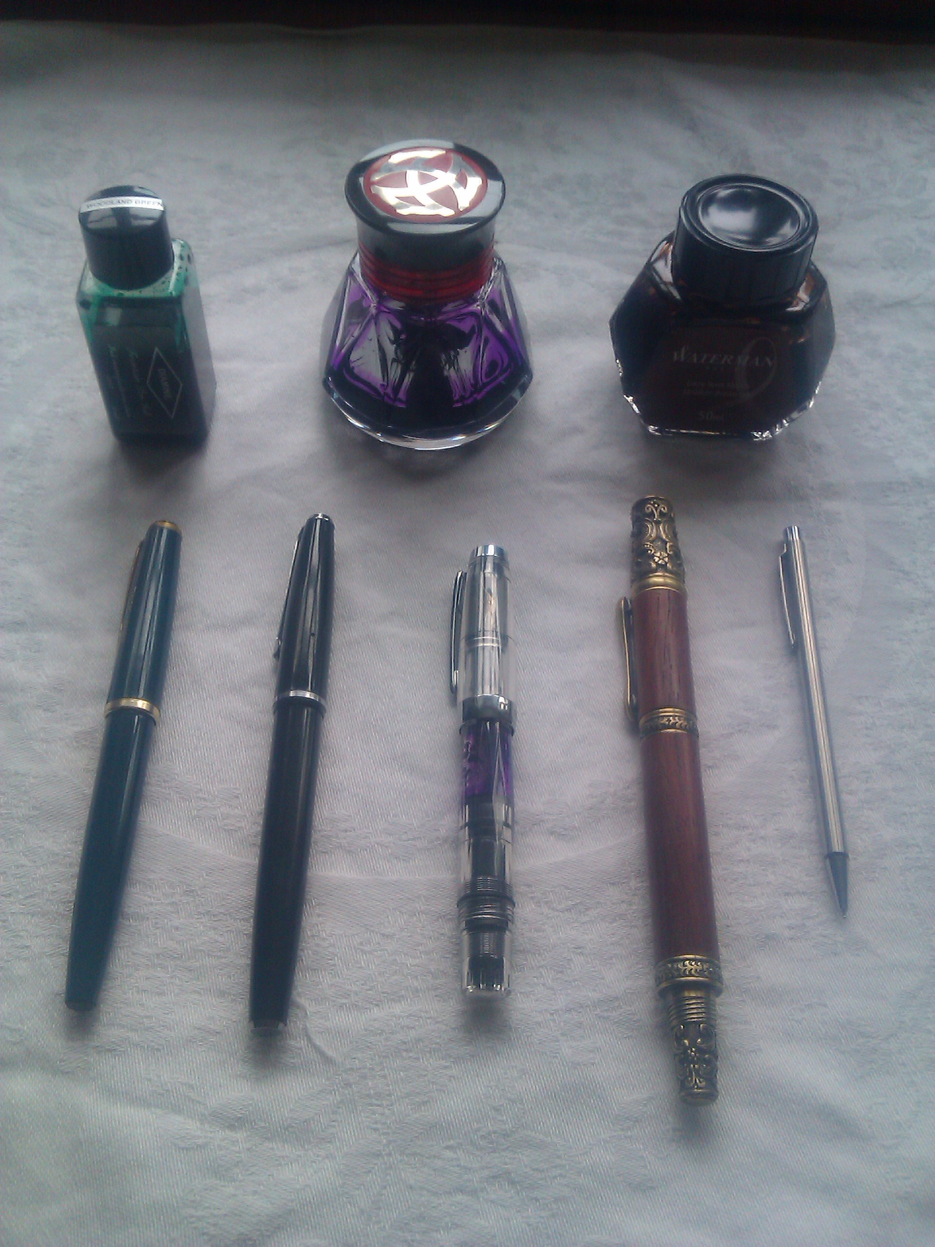
Today I thought I would indulge my stationery-geek side (and, hopefully, yours) by introducing you to my writing instruments. (No, I haven’t given them names. Yet.) Illustrated mostly with other people’s pictures, because mine aren’t much to look at.

First in seniority is the green Faber-Castell (with goldish accents) which I found, fully functional, in a box of disused fountain pens which was passed on to me by my husband’s family when they found I was interested in such things. (Now that’s the kind of family you want to marry into.) It was this pen that inspired my love for piston-filling fountain pens, and I used it to write the epically large first draft of my WIP. These days it contains Diamine Woodland Green and I use it mostly for writing in my spiritual diary.
From the same box of fountain pen goodness came the Platignum Shorthand Pen – black with silver accents. It uses a rubber sac with a squeezy bar to fill, with the downside of not being able to tell how much ink is left in it. Despite that drawback, it is rapidly becoming my go-to pen for general writing – shopping lists, to-do lists, notes – because it has such a fine line and isn’t too wet, so works well on general-purpose paper. It currently contains Waterman’s Havana Brown (now called Absolute Brown for Absolutely no reason that I am aware of.)

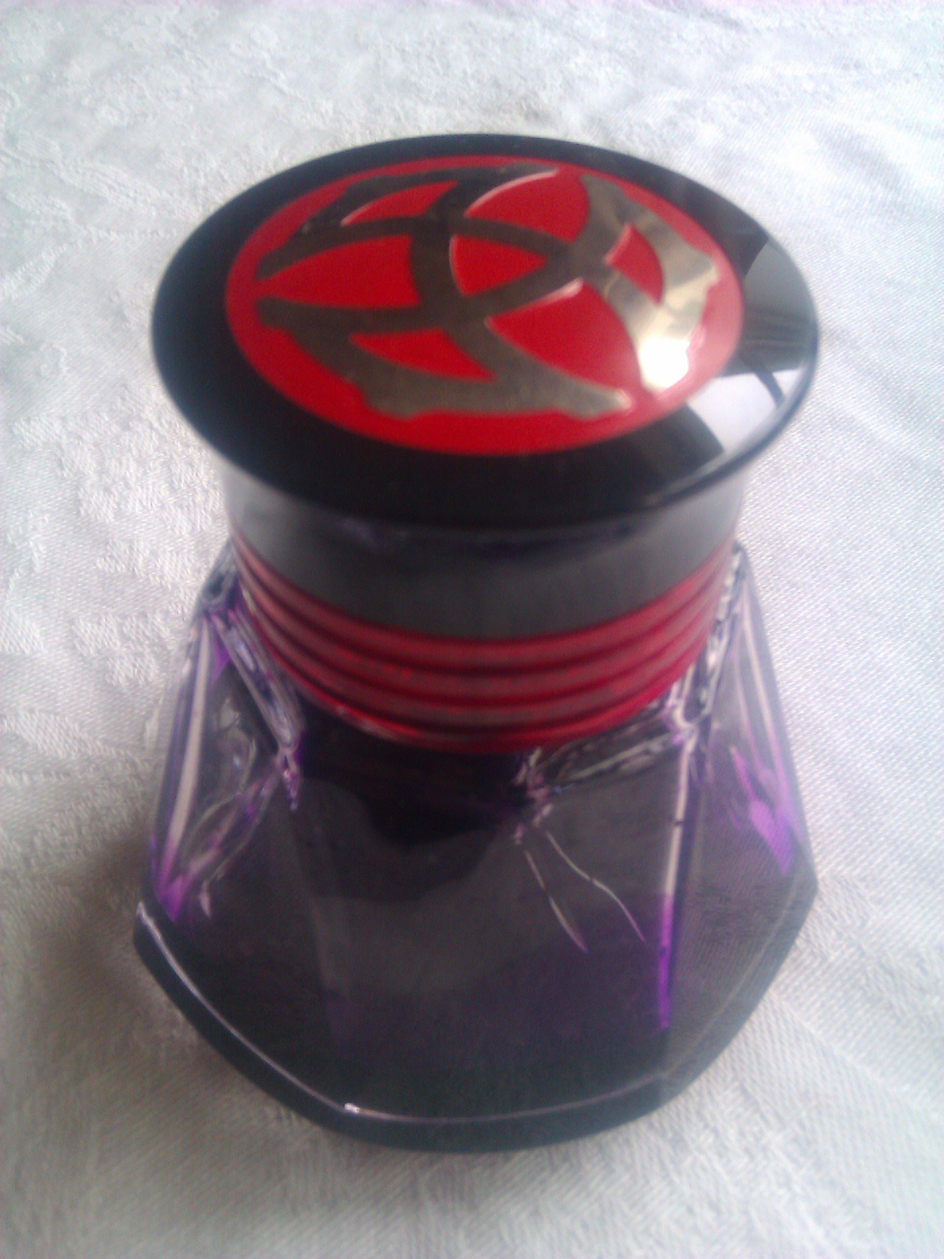
The next to enter my life was my first ever new pen: the TWSBI Mini, which I bought to reward myself for slogging through all 158,840(ish) words of the first draft. It’s another piston-filler; in fact, if you have a TWSBI ink bottle – which I do – the pen’s barrel can refill straight from the socket in the top of the bottle lid, without any of the messiness inherent in dipping a nib into the bottle.
Unlike all my other pens, it also has a clear barrel, so you can see how much ink is left at all times. This also makes it an ideal pen for using with coloured inks. Currently it contains Diamine Majestic Purple, thematic colour of ye olde WIP, and is used for notes and records thereon and thereof.
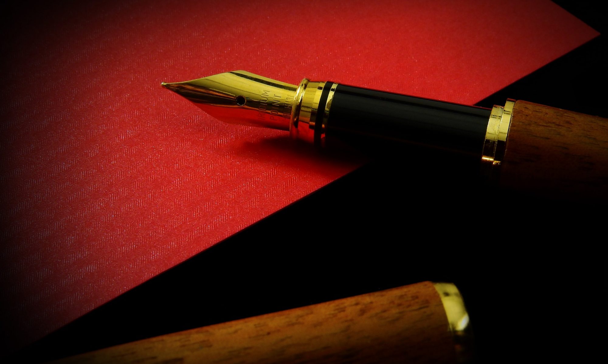
The fourth of my pens, a gift from my parents last Christmas, is undoubtedly the most aesthetically impressive to behold. (You can’t just look at this one. You have to behold it.) Almost baroque in its ornateness, it features a barrel of Papua New Guinean rosewood, and so much metal ornamentation I got pulled out of line and had my bag searched when going through airport security with it. It’s quite a heavy pen, so I don’t use it for long pieces of writing. It is best for using a) when one feels like being impressive and b) when one wishes to draw a satisfyingly final line through items on to-do lists.

It’s rather a wet nib (so it doesn’t care for everyday paper) and has a smallish (piston-filling) ink chamber, considering the overall size of the pen. It is also filled with my general use brown ink.
Finally, and most recently arrived in my collection of writing implements, there is a pencil. A reusable (i.e. mechanical) one, naturally, for the sake of the environment if not my laissez-faire attitude to getting up to sharpen things. It’s a Pilot Birdie, slim and silver and, well, small. It uses 0.5mm leads and is itself only 5mm thick. It’s designed for use as a notebook pencil, but hey – I’ve got small hands, and it sticks out far enough behind my hand to be comfortable to use. I got mine second-hand, so there’s not much eraser left, but that’s all right. I mostly wanted a pencil instead of a pen for my morning pages (which I’m thinking of shifting to nighttime) so that if I fall asleep mid-page I don’t wake up bathed in Havana Brown.


