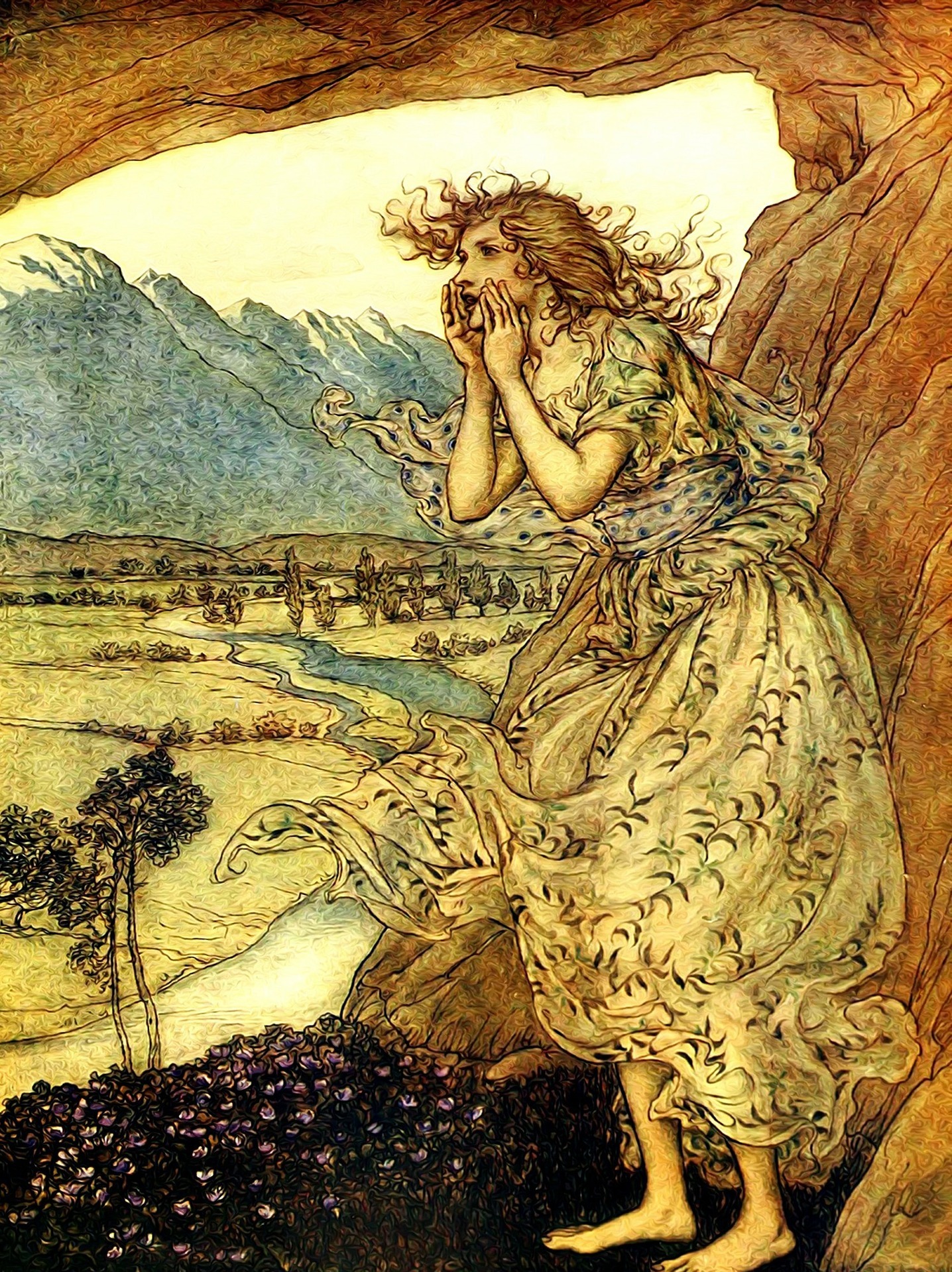
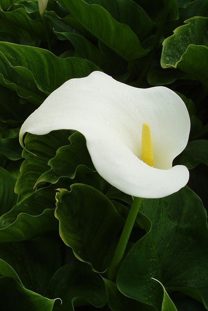
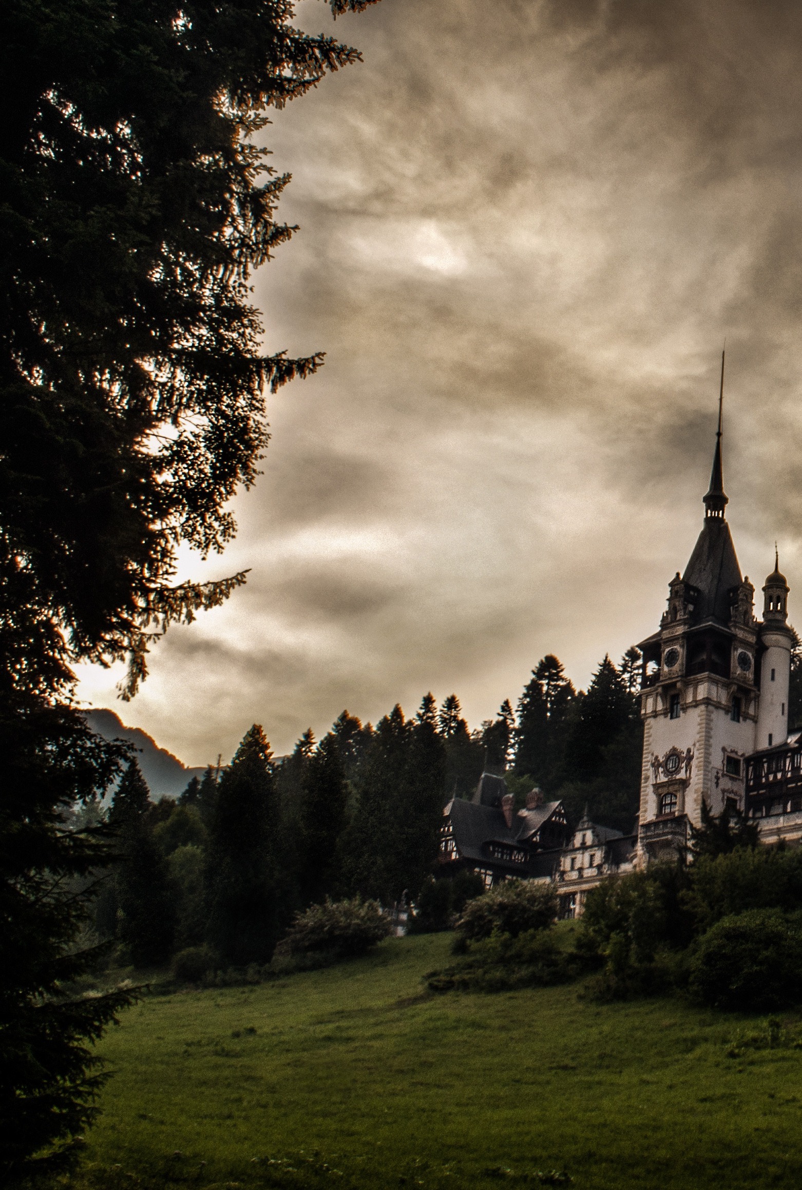
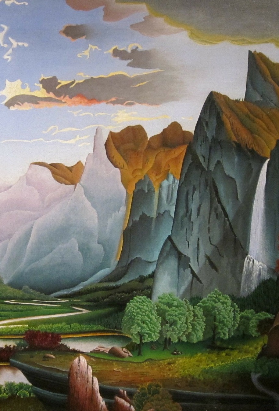
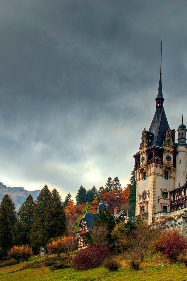
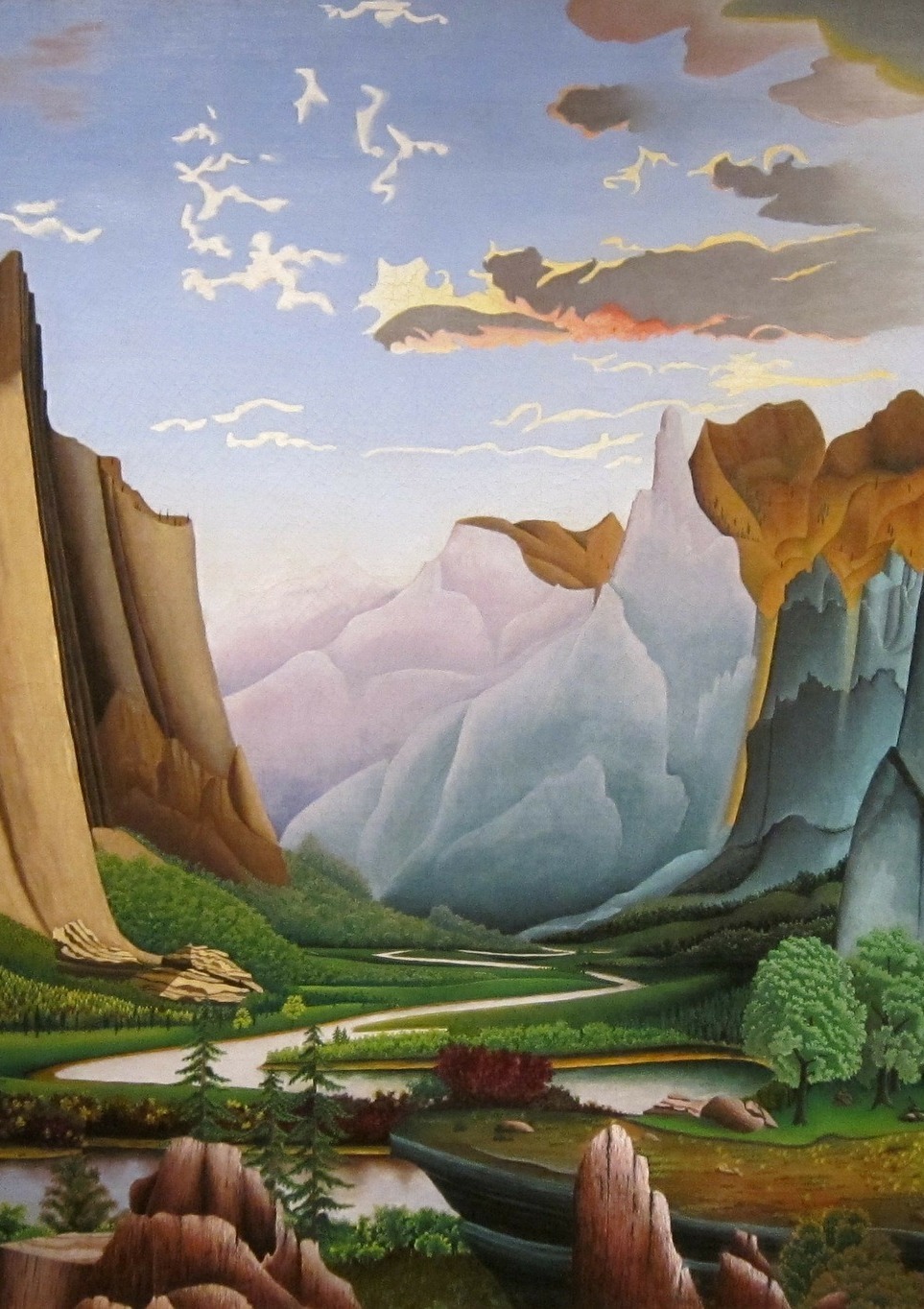
So, here are a range of images I am considering using as a basis for the front cover of Restoration Day. I would love to hear what you think of them – like, dislike, utter revulsion…
For those of you who have read the 3rd draft, which do you think fits best?
For everyone, read it or not, which image grabs you, draws you in?
Three things to bear in mind:
Firstly, these are just images, not finished covers – a beginning, not an end.
Secondly, the image may not fill the whole cover, but might instead be seen through a ‘window’ in an old-fashioned binding (or rather, a 2D rendition thereof) or through a gap in a hedge (ditto).
And thirdly, it will have to work at ‘thumbnail’ size as well as book-size and preferably also in black and white.
So, with those caveats out of the way, here are the contenders! Click on the image to see the original version.
What do you think? Votes, comments, all feedback welcomed!
