ἐπιεικής

I love this word. It means… well, as is so often the case with Greek words, it has a spread of meaning. It speaks of proportion, fairness and moderation. It is a question of what is appropriate, or fitting – like lagom. It is, in fact, the antithesis of taking more than one’s share. John V Taylor, in his book Enough is Enough, uses the word equipoise, meaning balance.

Beam and feet (close shot)“It is not poverty but balance we are after, and balance, I believe, may well mean for us in the affluent countries a reduction in our standard of living. But it would be an absurd exaggeration to say that for three-quarters of our population in Britain a reduction of standard would come anywhere near poverty.”

People tend to shy away from the idea of a reduction in their standard of living, but it is worth noting that ‘standard of living’ and ‘quality of life’ are not the same thing. ‘Standard’ refers largely to the physical, most notably wealth – how much you have, and how much you have compared to those around you. ‘Quality’ is more about how good your life is, rather than how many ‘goods’ you have.

This is rather like the difference between absolute and relative poverty. Absolute poverty is how little you have compared to what you need. Relative poverty is how little you have compared to those around you. I have always thought it strange that developed countries make such a to-do about so many percent of their population being under the poverty line, when the line is set as a percentage of the average. That means that if everyone in the country had their income doubled overnight, exactly the same number of people would be under the poverty line. Useful as an indicator of inequality, yes, but it doesn’t really say much about how many people are actually in genuine need – to my mind, a much more important thing to know.
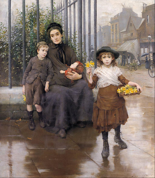
Thomas B. Kennington - The pinch of poverty - Google Art Project
Moderation isn’t a slump in your quality of life. It doesn’t limit your enjoyment of the world. As the philosopher Epictetus said, “If one oversteps the bounds of moderation, the greatest pleasures cease to please.” Eating chocolate is a pleasure. Eating an entire block of chocolate results not in pleasure but nausea. Having nice things is a pleasure. Having your house so stuffed full of nice things that you can’t see most of them, let alone have room to appreciate them, is not a pleasure but a source of stress (and much unnecessary housework).

Moderation, in short, is not a miserly form of self-denial, but a way to more fully enjoy your life. But it can be very hard! It’s a struggle sometimes even to remember that we don’t have a duty to have, when our world is so geared to continual growth – the complete opposite of moderation.
John Taylor illustrates: “to take another example which is no flight of fancy, a well-known company produces 9 million articles a year, knowing that the demand for and actual use of these articles cannot exceed 5 million. The further 4 million are necessary for ‘growth’, though they meet no need. They have to be pushed (with a commission on sales) as courtesy Christmas presents which other firms may buy to distribute to their business associates. But any system of accounting which can describe as ‘growth’ 4 million articles thrown new-made into waste-paper baskets must be deliberately blinding itself to the reality of the whole.”
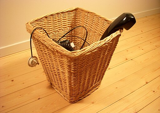
Papierkorb 2009
To look at it metaphorically, moderation dines well and ends the meal enjoyably replete. Consumerism – well, consumerism is Mr Creosote. Continual growth cannot go on forever. The After-Dinner Mint of Doom is coming. Of course, it doesn’t have to be doom all round. Some changes may be forced upon us in time, but most of us in the developed world currently have the ability to make our own choices about how much we consume, of what.

Perhaps it’s time to say, “Thank you, I’ve had enough.” Or, as a friend of mine taught her children to say, “Thank you, I have had an elegant sufficiency.” More cake? More toys? Thank you, I’ve had enough. What about some more clothes, or another little gadget – you don’t want to fall behind the times! Thank you, I have had an elegant sufficiency.

Of course, good manners can – and should – extend further than a polite refusal. Perhaps it’s time that we started asking questions of others at the table. May I help you to a share of these resources? Allow me to offer you a fair price… Can I serve you with some clean water?

Glass-half-fullἐπιεικής is not the boring middle-of-the-road. It is the pathway to a beautiful life, not only for us, but for others. And that’s why I love it.
Of Flags, Fire and Our Piratical Destiny

There is a tide (Shakespeare informs us), in the affairs of men, which, taken at the flood, leads on to fortune. Omitted, all the voyage of their life is bound in shallows and in miseries. On such a full sea are we now afloat, and we must take the current when it serves, or lose our ventures.

What Shakespeare is saying (or would be if he had sufficient foresight) is that New Zealand should change its flag, and so doing, steer the ship of state toward our remarkable and unexpected destiny. His metaphor is a well chosen one.

Amerigo vespucci 1976 nyc aufgetakelt

Let me explain.

The present referendum is our Prime Minister’s idea. It’s to be a two-part postal referendum: in the first, we’ll narrow down a shortlist of four to the lead contender, and in the second, we’ll choose between that and the status quo.

It’s rather like the America’s Cup, really: contenders fight for the right to duke it out with the present holder of the title. Unfortunately, the long-list of forty was released to the general public, even though they were not permitted to have a say on which made it to the short-list – rather like allowing thirty-six yachts to sail past but not to actually race.

We are now in the first (or Louis Vuitton) stage of proceedings, in which we are asked to rank the four contenders in order of preference. And here they are, not in order of preference (or at least, not mine):

Kyle Lockwood's New Zealand Flag This design, by Kyle Lockwood, is probably closest to our present flag, at least in the lower right, and maintains the traditional red, white and blue colour scheme.

Kyle Lockwood's New Zealand Flag (alt 1) Great minds think alike, you say (or fools seldom differ, depending on your vexillological tastes), but no, this design is also from the teeming brain of Kyle Lockwood.

NZ flag design Koru (Black) by Andrew Fyfe This design, from Andrew Fyfe, of a simple black and white koru is, in my opinion, the winner of the unofficial “which flag will look best whilst burning” competition.

There is also talk of including the Red Peak design (by Aaron Dustin) but as of this writing, no decision has been made – or at least, no decision has been announced.

It is, however, the fourth of the designs on the current short-list (designed by Alofi Kanter), which is my favourite.

NZ flag design Silver Fern (Black & White) by Alofi Kanter

Please, do not mistake me for a rabid sports fan. I can, if I concentrate, remember which sort of oval-ball game it is the All Blacks play, but that is about the extent of my sporting knowledge and interest. I do not even own a pair of red socks. No, I favour this design for two simple reasons.

The first is its similarity to this, the flag of anarcho-pacifism:

Anarcho-Pacifist flag New Zealand has long been a leader when it comes to waging peace. Te Whiti o Rongomai, one of my personal heroes, was leading indigenous people in non-violent resistance before Gandhi was born or thought of.

Later, we declared our entire nation a nuclear-free zone – despite being the first to split the atom. This was enforced, even to the extent of refusing to allow the vessel bearing our own Head of State to enter our waters. (For the record, totally the Royal Navy’s fault. They refused to “confirm or deny” that they had nuclear material on the Royal Yacht Britannia alongside the Queen.)

Let us be frank: New Zealand has never been known for its devotion to, or respect for its leaders. Hierarchical we are not. Hence the anarcho-pacifism.

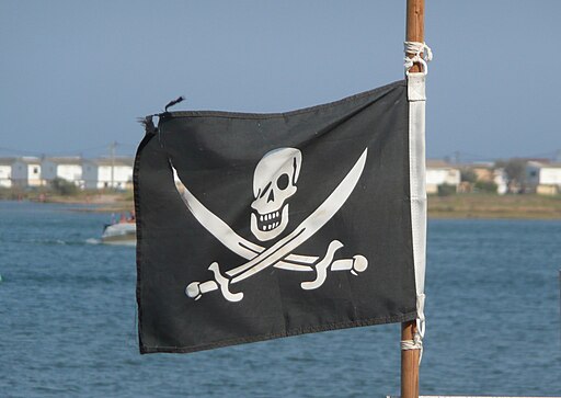
The second reason is that black and white flags are traditionally emblematic of pirates. But wait, I hear you say. How can you possibly pair anarcho-pacifism with anything of the genus Jolly Roger? Isn’t it a symbol of murder and mayhem? Well, no. Pirates didn’t actually fight under it.

Pirat flag

To my surprise on looking into the subject, I found that the black and white flag was not flown by pirates all the time, but only when about to attack. (You are not helping your case, I hear you say. Bear with me.) Pirates would fly false colours – or no colours – until they had approached their prospective victim, at which point they would run up the jolly black-and-white: declaring their intentions, rather like a Victorian suitor.

The ship thus surprised then had the choice of surrendering or fighting. If they decided to surrender, they would be spared. If they decided to fight, the pirates would then run up a red flag: no quarter would then be given. (Privateers, on the other hand, weren’t allowed to kill you regardless of how hard you had fought before you surrendered.)

I have even heard it said that any ship flying under a black and white flag can, under international law, be treated as a pirate ship, but, to quote Wikipedia, [citation needed].

Map New Zealand-en

New Zealand is a nation surrounded by water (in fact, the furthest you can get from the coast is in the middle of a lake) and therefore eminently suited for being a pirate nation. With our cheerful disregard for other nations’ demands (surrender those children to the Communists, stay away from that atoll…) we are half-way there already.

In fact, with the TPPA demanding that we extend copyright protection to seventy years after the creator has shuffled off this mortal coil, now is an excellent time to go pirate. Being pacifist pirates, we will of course resort only to culture piracy, which unlike old-school piracy ensures that, post-pirating, the piratee still has their goods (this in kindergarten lingo is known as “sharing”).

Furthermore, anarcho-pacifism and piracy are practically enshrined in our national anthems. “Confound their politics / frustrate their knavish tricks” says the one (that’s the anarchism) and “Peace not war shall be our boast,” says the other (that’s the pacifism), going on to add “May our mountains ever be / freedom’s ramparts on the sea” (that’s the piratical bit).

Opera Australia's Pirates of Penzance

The whole point of a flag (although to be fair, flags aren’t usually pointed, unless you’re Nepal) is that it is symbolic of the entity it represents, in this case, the country of New Zealand. As the flag is, so shall the nation be.

I therefore call upon the people of New Zealand to use their Louis Vuitton vote to move our nation one step closer to fulfilling its destiny, as the world’s first anarcho-pacifist pirate state. Arrr.

Lagom: the Way of Goldilocks

Lagom is a Swedish word signifying just the right amount or proportion of something. (Not to be confused with mathom, which refers to old things suitable only for perpetual regifting.)

“Just right” is just what Goldilocks was looking for, and, I’d argue, just what we should be looking for ourselves.

The story of the three bears 1839 pg 30

Bigger is not always better; less is sometimes more. But then, sometimes less is actually less. I loathe the idea of being smothered in my own excess, but I don’t want to strip away the things I genuinely enjoy and which enrich my life. I am in search of “just right” (but unlike Goldilocks, I am not looking for it in other people’s houses while they’re out)!

Lagom is a wonderful concept, and the best thing about it, in my opinion, is that it isn’t prescriptive. It doesn’t say “this much”. It says “just the right amount” – which is different for different people. To illustrate the point, let us consider interior decoration.

For some, this is lagom: the minimalist look of utter simplicity.

Mauerbach 20110923 0059

I like the look, myself, but I don’t think I could actually live like that. For more than a day or two, anyway. Where would all the books go?
For other people, “just right” is more elaborate, or perhaps even a bit luxurious. Like this.

Government House Trendy Sitting Room (8415287951) (2)

And for some people, “just right” could be described as creative chaos. Again, it’s a nice place to visit, but I wouldn’t want to live there, myself. Not with all those swords on the wall. Not after the earthquake we had last night…

The problem is, of course, that it isn’t always easy to know what constitutes “just right” for you. Sometimes you’ve just got to whip out a spoon and try that porridge.

Generally speaking, most of us in the Western world have got rather full bowls. If you’re staring indigestion in the face, don’t feel you have to clean your plate. Consider spooning some out – into the smaller bowl, or out the window if it’s gone all cold and manky.

Whether you’re considering possessions, portion size or anything else, follow the Way of Goldilocks and ask yourself: Is This Just Right?
What’s lagom for you?

Denslow's three bears pg 5

If you were wondering who the old lady in the top picture is, she’s Goldilocks! She was originally a nasty old woman – and she wasn’t even called Goldilocks for her first sixty-seven years in print.