Preparing the cover for Amiant Soul was a confusing and somewhat nerve-wracking business. It wasn’t just that I wanted deeper tones on the cover image, or even that I wasn’t entirely qualified to make those changes (i.e. completely ignorant of how to go about it, and succeeding only by means of some rather messy trial and error).
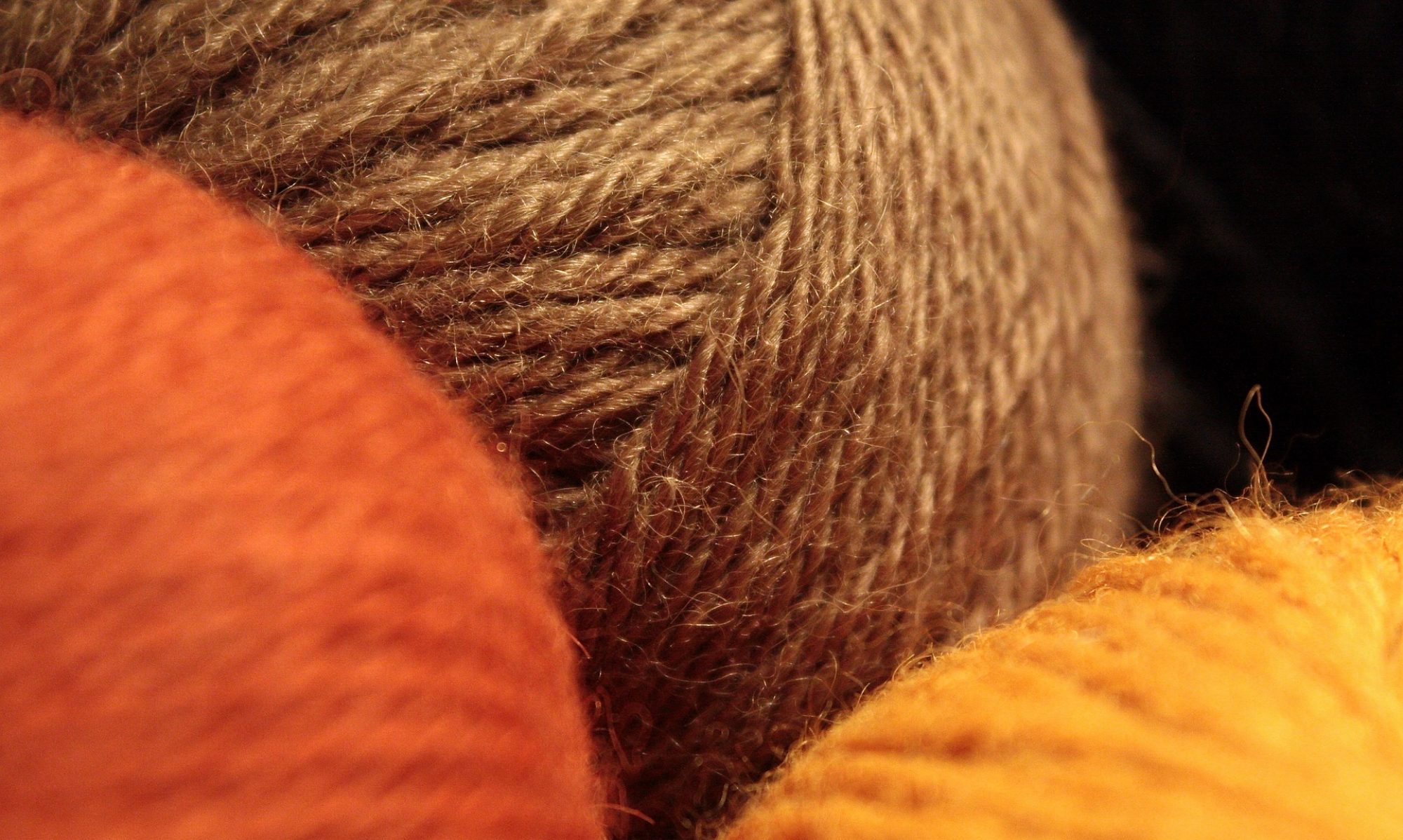
The original image.
It was the way the image appeared on the screen – or rather screens. I work with two screens, one built into the laptop I use, which is a more bluish toned screen, and one separate monitor, which is less blue. Naturally, the cover image appeared different on each screen. That I was prepared for.
At laaaaast, we are getting toward the publishy bits of the Work In Progress!!! And as is customary on these occasions, I have here a selection of ten images for you to vote on as cover images for the book in question.
I’d love to hear from those of you who have read the book as beta readers – which image do you think best evokes the book and its feel?
I’d love to hear from those of you who haven’t read the book – which of these images would you find most appealing?
And whether you’ve read it or not, please imagine each image adorned with some beautiful typography which reads Amiant Soul – and also my name, but in smaller letters. Do bear in mind, when formulating your judgement, that the image will need to look good book sized and thumbnail sized, and also in black and white.
I’ve been sitting on an idea for some time, like a hen on an egg, and I’d like to hear your views on it. (Addled, or ready to hatch?)
I’ve trawled through the first seven years of the archives of this blog, cherry-picking all the really good bits. The idea is to compile them into an ebook – with some extra material – and make it available to the public at a minimal price.
The questions are as follows:
One: do you think this is a good idea (i.e. do you think there’s a market for it)?
Two: do you have any suggestions as to the title? I’ve had ideas including:
Eccentric Ethic & Aesthetic (a former tag-line for the blog)
Unconventional and Slightly Strange (the definition of eccentric)
Old-Fashioned Fruitcake (the present tag-line of the blog)
Sinistra Inksteyne: The First Seven Years (fairly self-explanatory, though Sinistra Inksteyne isn’t the site name any more and there’s always a problem with misdirecting people to the old site which still has that in the url)
Some of these might need a subtitle explaining what the book is (truth in advertising!). The possible BISAC codes include Humor/Form/Essays, and Literary Collections/Essays – or possibly even Literary Collections/Women Authors (though I don’t know if I qualify for the latter, being woman singular).
The overall feeling is one of light-hearted amusingness and oddity with the occasional more serious post for a bit of chiaroscuro. Rather like the blog as a whole, but more so – the cream of the jest scooped off the top, as it were.
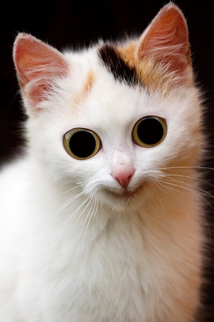
Funny and cute? Or creepy?
Three: do you have any suggestions for the cover? The above looks fun (or is it creepy?), but a lot also depends on the title.
So there are my three questions, and I’d love to hear what you think about any or all of them – or anything else that strikes you as relevant.