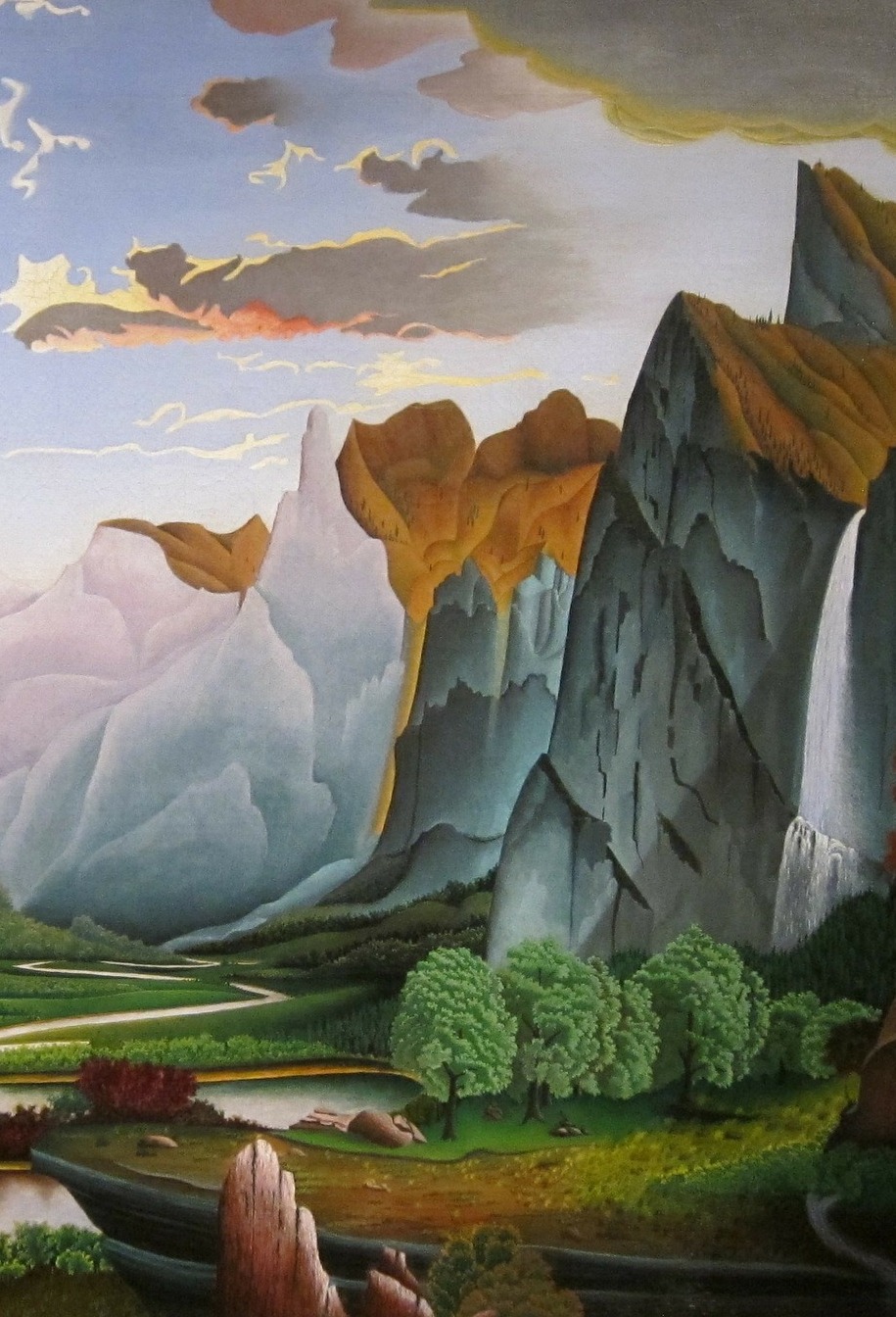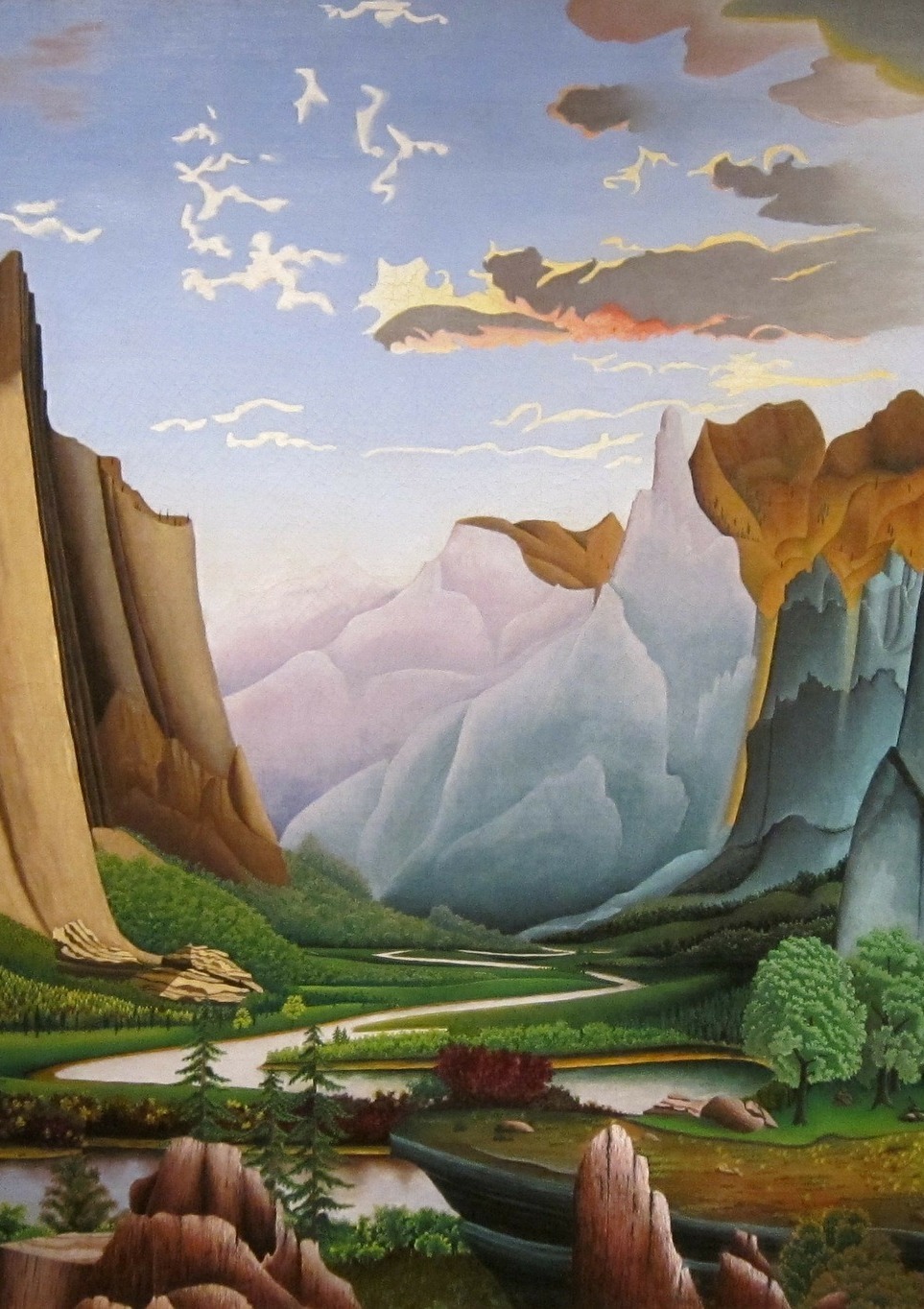
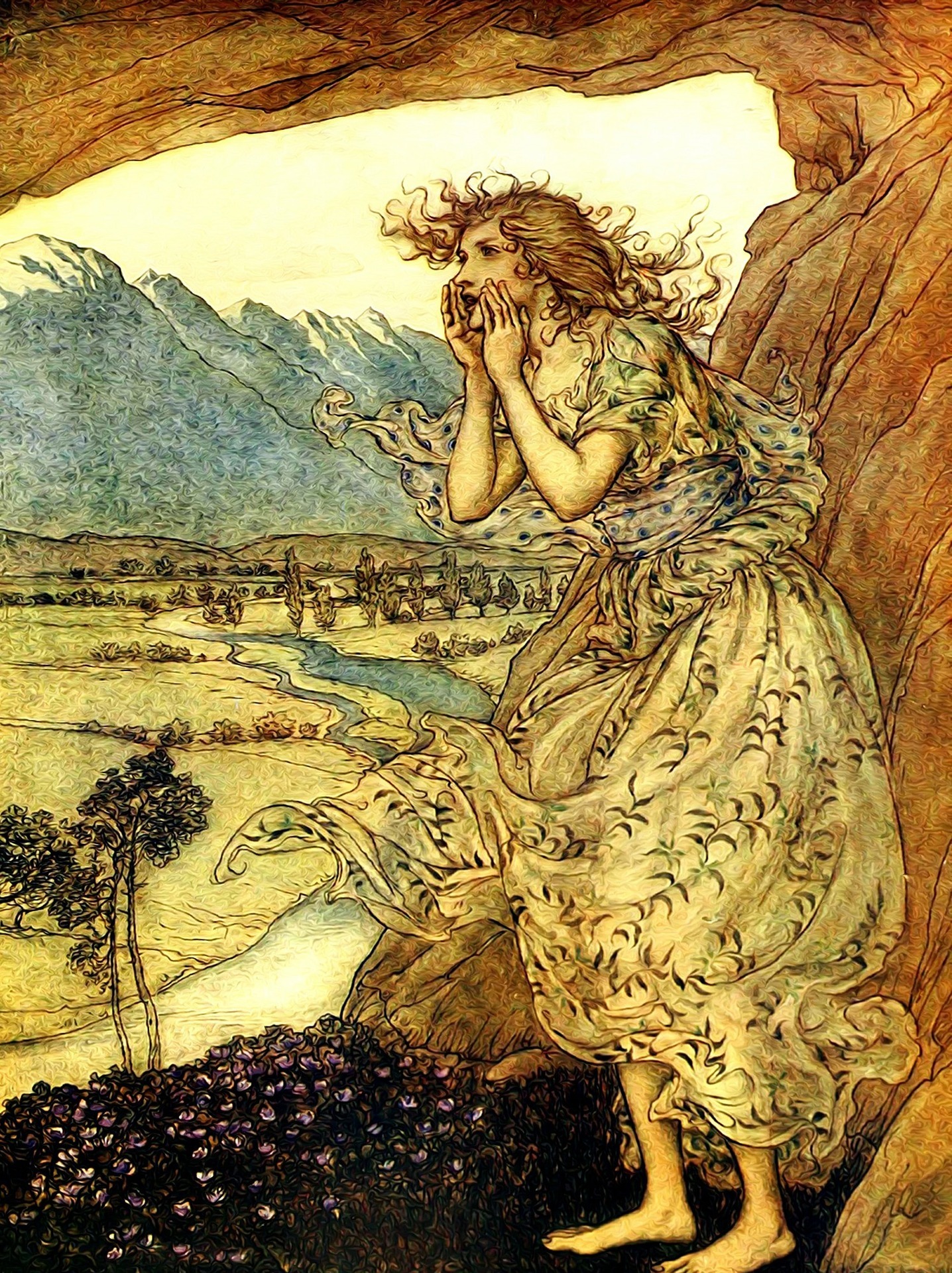
Two and a half years ago (can you believe it?) I asked you all, my dear readers, to weigh in on the question of what cover image to use for Restoration Day, with ten images paraded before your eyes. (Spoiler: the winner was Contestant #2.)
Now, with The Wound of Words making its way through the convoluted pipeway to publication, I find myself in need of your opinions again. As before, the selected image needs to look good in every size from thumbnail to 14x21cm – and preferably also in black and white; it needs to not disappear into the (white) background on a webpage, and of course, it needs to draw the reader in without giving a false impression of the book’s contents.
Also as before, there are ten images. But this time, either because I am getting old and boring or because I am getting more mature and have a better idea of what I like (consider what you know of me and pick accordingly) they are variations on six themes, instead of the seven last time.
On the plus side, my GIMPing skills have advanced to the point where each cover image is approximately the shape/proportion of the actual cover, so what you see is more or less what you will get, except of course that the final version will have a professionally-designed title and name on it and will therefore look Much Better.
Here then, for your discriminating judgement and critique, are our ten contestants.Continue & Comment


_harald_slott-m%C3%B8ller.jpg)