It is a fact fairly widely acknowledged, that those who wear quite sober clothes (whether for professional reasons or otherwise) often make an exception for novelty socks. Others, even more covertly, wear brightly patterned underwear (generally a secret unless you get hit by a bus). I myself go in for lively nightwear.
“What could be more fun than a prim floor-length nightie covered in rocket-ships, say, or jelly-beans?” So I wrote back in 2018, and I have not had cause to revise my opinion, barring a minor alteration to ankle-length. It did, however, take some time for my psyche to recover from the epic battle which was the Stripy Nightie of 2018, but time is a great healer (and Covid a great eraser of memory) and here we are.
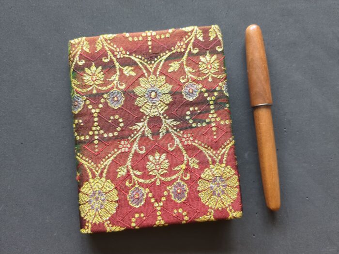
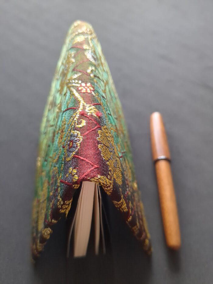
This delectable morsel of stationeryhood is a silk sari journal made by Love Calcutta Arts, a business which exists to provide women with the option of employment that isn’t the sex trade. A lot of LCA’s products involve what is popularly known as upcycling: turning old saris into kitchen trivets, quilted coverlets, or book upholstery.
The sari-covered journals come in two sizes (small: 11cm x 13.5cm x 40 leaves; large: 15cm x 18.5cm x 60 leaves) and a range of colour groups: red, green, purple, orange, black, and pink. And because they aren’t mass-produced in a factory, but instead made by carefully trained craftswomen in a workshop, they are all different.
My one (let’s be honest: my first one) is Small and Red.
It is time, I believe, to bring back mourning. Not mourning as in grieving – that has never left us, nor will while this world lasts – but the clothing which denotes its presence.
The West is not very good at either of them, for the most part. We expect people to “get over it” or “move on” in not much more than the standard three days bereavement leave, and as for the clothes – well. When I tell you there is a company offering such products as tees and tank tops with slogans like “live, love, grieve”, “grief vibes” and “grieving AF”, you will see how far we have come from the days when mourning clothing was both dignified and generally recognized.
One of these young women is in mourning. Guess which.
This can in part be blamed on the mass deaths of the World Wars – very bad for morale, living in a sea of visible loss – and, going further back than that, the Victorians. The Victorians were huge supporters of people taking time to mourn, but rather overdid it with their strict codification of mourning which was not necessarily connected with your actual emotions. (Not to mention the annoyance when some sour old distant relation dies the moment you get a new outfit, thus preventing you wearing it while it’s still in fashion.)
I do not propose that we return to the suffocating etiquette of the nineteenth century, but that we reintroduce a shared visual vocabulary of loss. To that end, a few suggestions.
Grief varies in intensity over time (hopefully in an overall lightening trend). Mourning clothes should reflect this.