Preparing the cover for Amiant Soul was a confusing and somewhat nerve-wracking business. It wasn’t just that I wanted deeper tones on the cover image, or even that I wasn’t entirely qualified to make those changes (i.e. completely ignorant of how to go about it, and succeeding only by means of some rather messy trial and error).
It was the way the image appeared on the screen – or rather screens. I work with two screens, one built into the laptop I use, which is a more bluish toned screen, and one separate monitor, which is less blue. Naturally, the cover image appeared different on each screen. That I was prepared for.
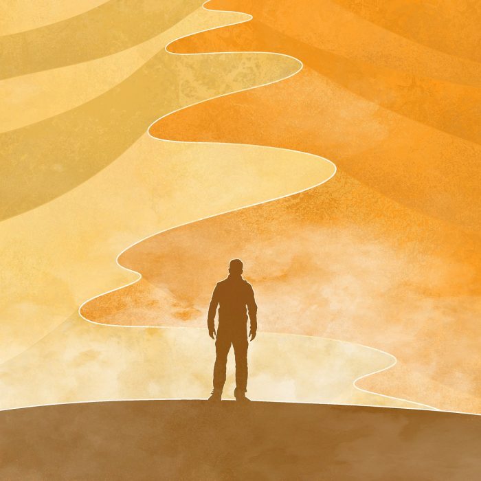
The really confusing bit was the way the image appeared different colours depending on the angle from which one viewed it. Seen straight on, it looked a panoply of oranges. Seen from above, it paled to yellows; seen from below, it deepened to red.
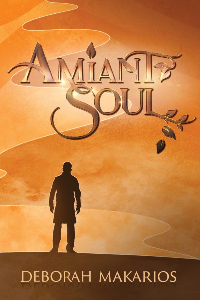
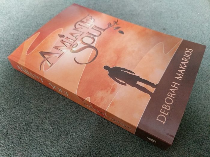
Having passed through the magic hands of Eve Doyle, it was looking absolutely dishy at any angle, but the question remained – what would the printer make of it? What would it look like in a non-backlit scenario?
Today my question was answered. For me, at least. You will have to wait until you have a copy of your own. In the meantime, here’s a photo of what it looks like to my phone camera (your eyes may vary; mine certainly do).