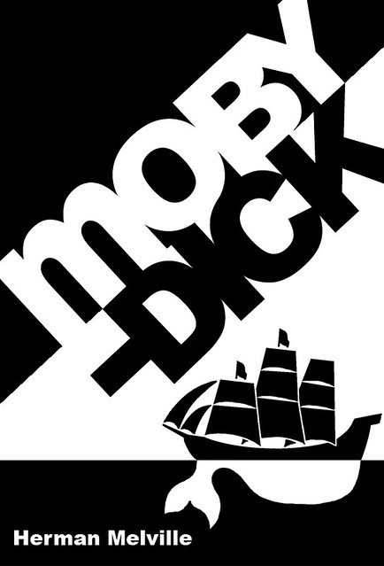
Let us be literal for a moment: we generally judge books by their covers. If the cover is bleh, or just doesn’t suggest the sort of read we’re looking for, we move on. If it intrigues, we take a look inside.
 Personally, I’m put off by garish covers with colours that attack each other, depictions of hysterical half-naked people, and convoluted decoration that obscures those all-important details like the title. Also fonts that are so stylized that making the title out is like deciphering your great-aunt’s handwriting.
On the other hand, old leather bindings with gold tooling draw me like a bee to honey, regardless of the actual contents of the book. (Minor Products of the Phillipine Rainforest, Volume II? Well, why not?)
What do you look for in a cover? What engages you, what drives you away?

Mmm, not leather, because to me that says “I cost more than you want to spend on a book.” 🙂 Maybe I’m not frequenting the right kinds of used bookstores.
I’m very much with you on the readability of titles, though. And not just readable when in my hand – unless it’s a specific author I’m looking to collect more of, your title needs to readable from the shelf to get me to even pick it up.
I do tend to like bright colors (though not clashing) because I prefer fantasy and sci-fi, which both lean heavily toward bold colors. In those genres (well, in my Westerns too), I like the old-school covers with hand done illustrations. (For example, I like Anne McCaffrey’s old Michael Whelan covers much better than the newer mostly white ones. And don’t even get me started on the new Pratchett covers that are mostly black! Josh Kirby’s covers may have been a little busy, but at least they had character.) I guess I like being able to support an artist as well as an author. Plus, the colors make a bookshelf look cheery. 🙂
I think some of the modern monochromatic covers are intended to appeal to people who worry that reading fantasy makes them look immature, and what could say ‘I am a serious grown-up’ better than plain black?