So, here are a range of images I am considering using as a basis for the front cover of Restoration Day. I would love to hear what you think of them – like, dislike, utter revulsion…
For those of you who have read the 3rd draft, which do you think fits best?
For everyone, read it or not, which image grabs you, draws you in?
Three things to bear in mind:
Firstly, these are just images, not finished covers – a beginning, not an end.
Secondly, the image may not fill the whole cover, but might instead be seen through a ‘window’ in an old-fashioned binding (or rather, a 2D rendition thereof) or through a gap in a hedge (ditto).
And thirdly, it will have to work at ‘thumbnail’ size as well as book-size and preferably also in black and white.
So, with those caveats out of the way, here are the contenders! Click on the image to see the original version.
What do you think? Votes, comments, all feedback welcomed!



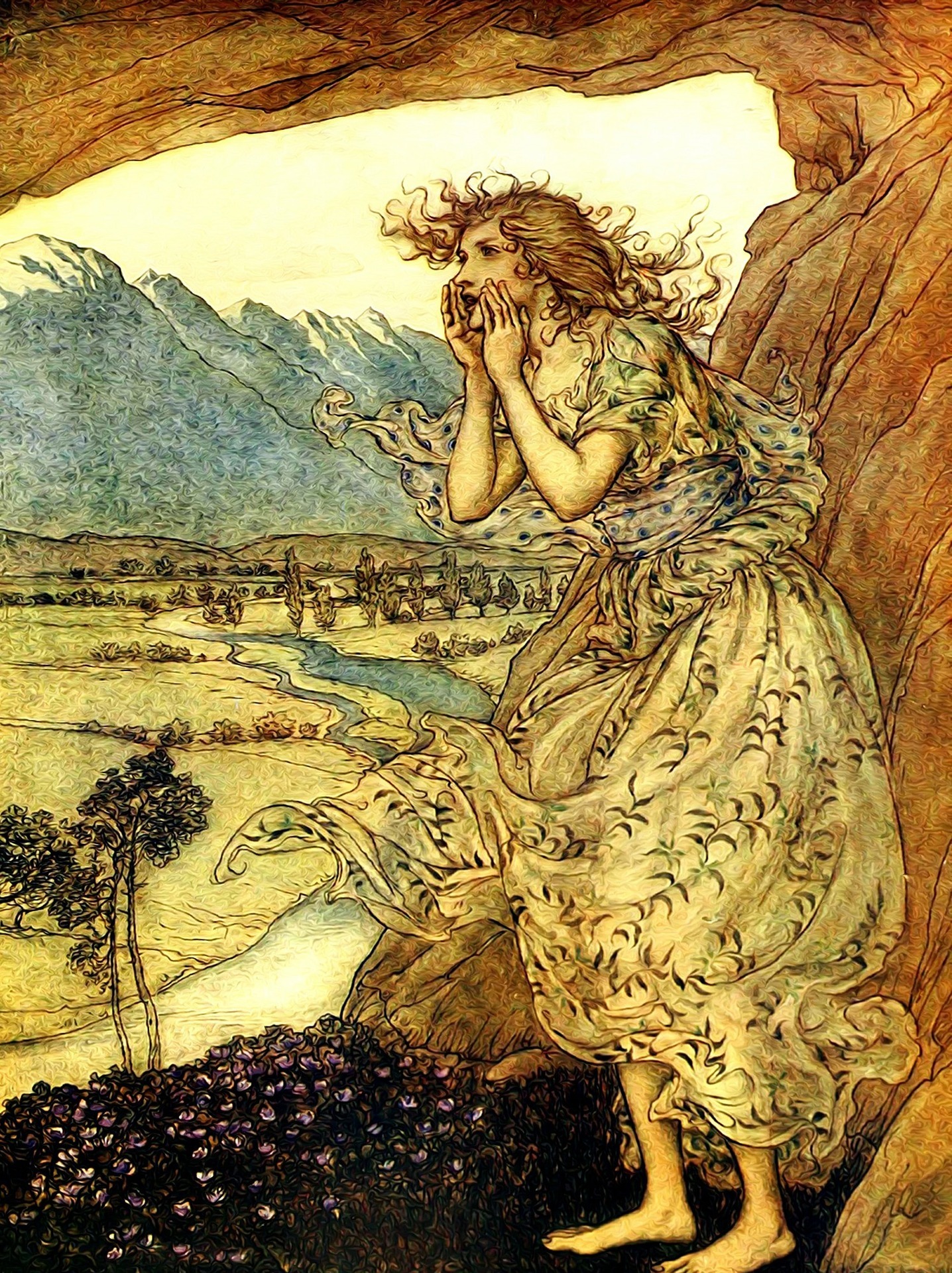
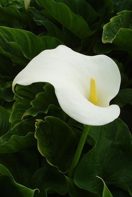

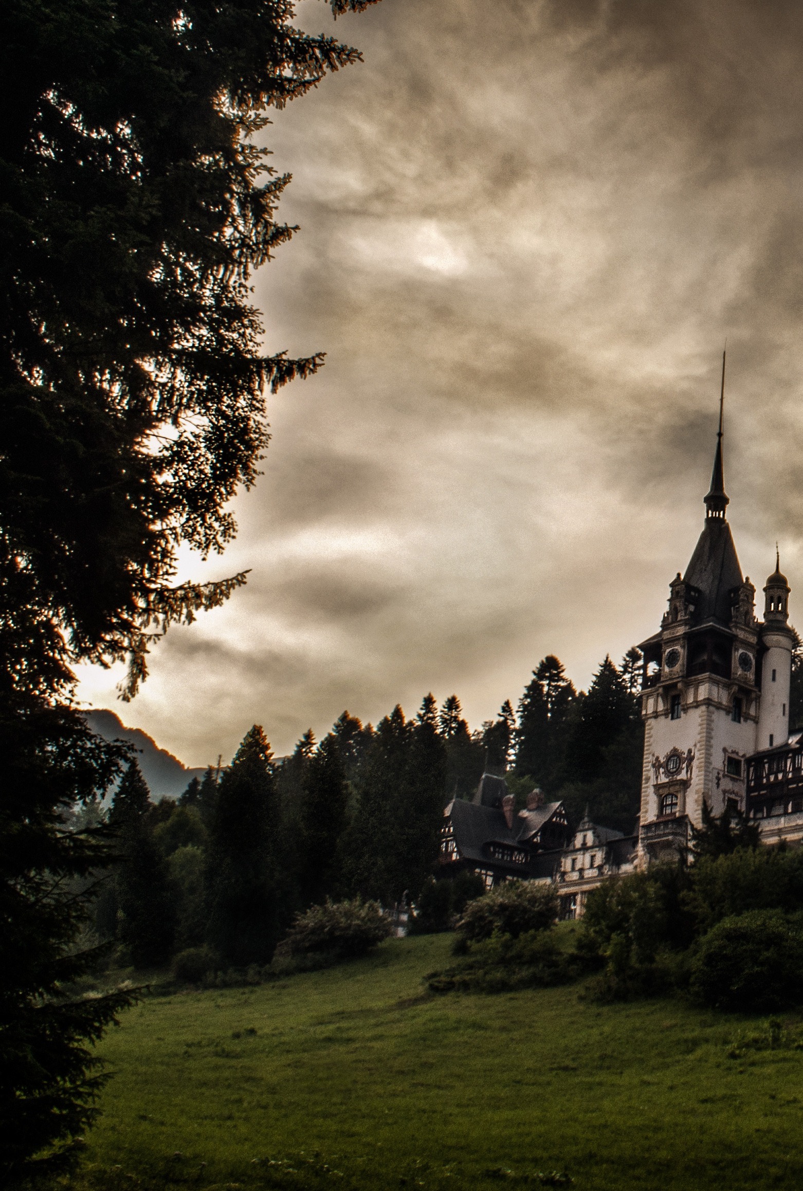


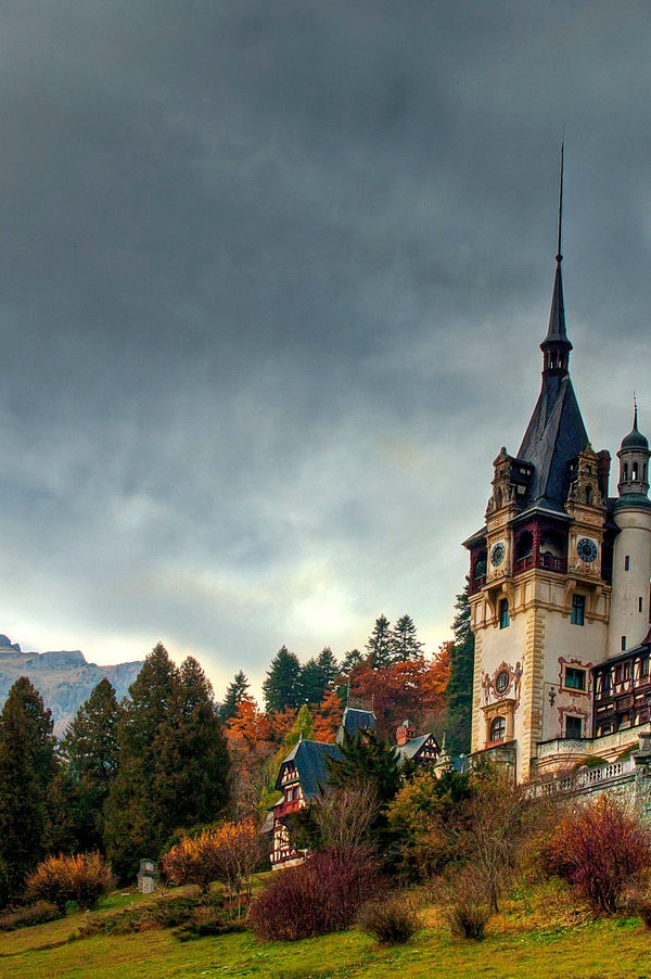

Well, I think my favourites are 1, 2 and 4 in that order. They fill the bill in terms of simpicity, relevance and shrinkability. No. 3 has merit too, in terms of relevance on lots of levels, but in general i like the idea of keeping Lily’s looks the preserve of the reader’s imagination. Not choosing 4 gives you the option of changing her name!
All the best with the process from here on – exciting, but like when building a house, having the walls up and the roof on belies the amount of time to get all the services installed, the curtains made, and so on. Hang in there 🙂
Wise words – thanks!
10 is my favourite, followed by 7 – I love the style & think it fits the story.. I realise it’s the same picture, but I prefer 10’s composition… Otherwise it would be 4… I think in terms of thumbnailing, the size & font of the title & author name will be important. A major piece of feedback from Writers Digest on my book was that my name was too small, so visibility is definitely something to take into account!
Definitely a consideration! Which means, of course, leaving space for them…
Highest score: 1, 2, 5; mid score: 3, 6, 7, 9, 10; don’t use: 4, 8.
The first 3 made an impact. The mid-scores looked nice. The bottom scoring ones seemed tedious and ordinary to me. Everyone’s different I know!
Chacun a son gout, indeed. Thanks for the feedback – it’s all grist for the mill!