
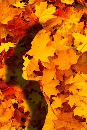
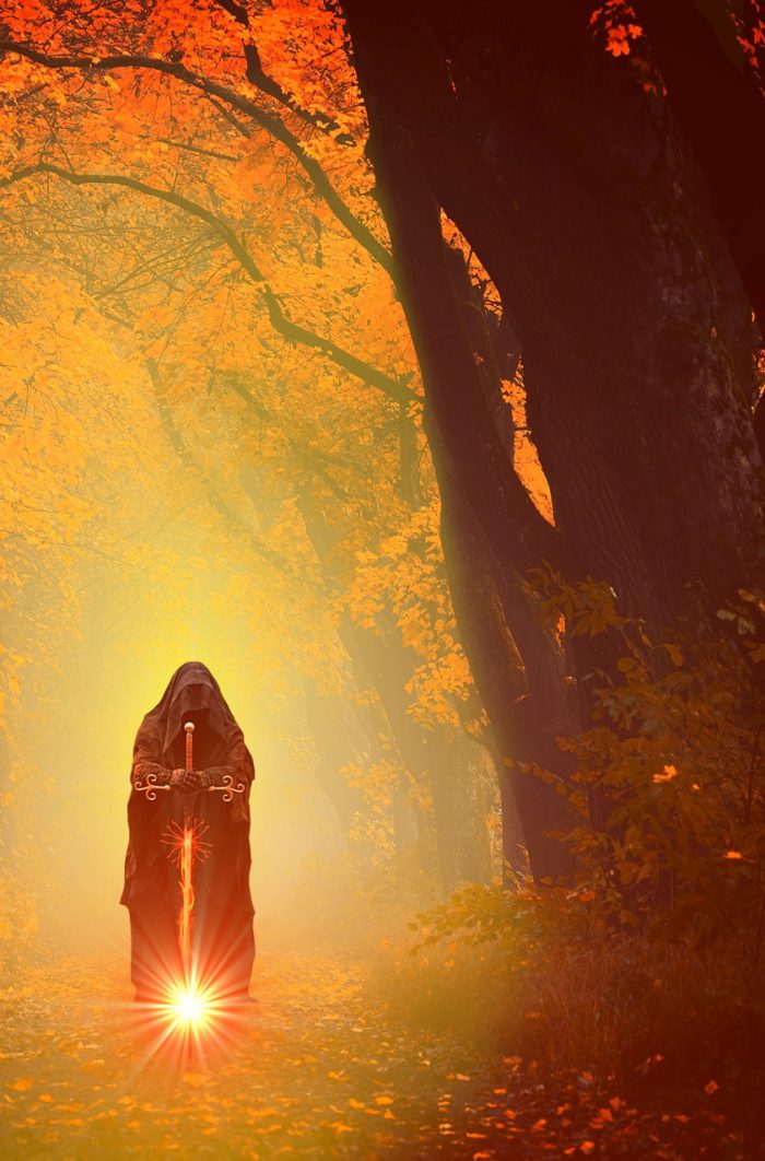
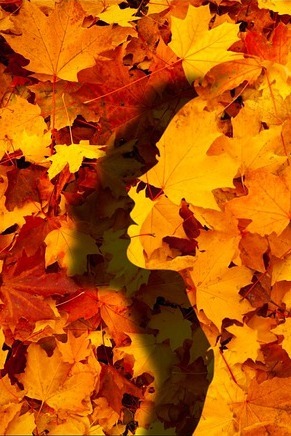
At laaaaast, we are getting toward the publishy bits of the Work In Progress!!! And as is customary on these occasions, I have here a selection of ten images for you to vote on as cover images for the book in question.
I’d love to hear from those of you who have read the book as beta readers – which image do you think best evokes the book and its feel?
I’d love to hear from those of you who haven’t read the book – which of these images would you find most appealing?
And whether you’ve read it or not, please imagine each image adorned with some beautiful typography which reads Amiant Soul – and also my name, but in smaller letters. Do bear in mind, when formulating your judgement, that the image will need to look good book sized and thumbnail sized, and also in black and white.
Here are the contenders!


So what do you think? (My apologies to those who were irked by the images being different sizes.) All opinions gratefully received, with or without accompanying line of reasoning.
In my mind, number ten fits best with the book (and just looks a little better balanced than number three).
Duly noted – thanks!
It’s a while since I read, but I like number 8 best. I am a lover of autumn colours and leaves.
Next I like 10, although I’d expect no hat etc on the head.
Ta!
Alas, no hat etc would require rather more photo manipulation than is likely to occur.
I quite like 3, 8 and 7 in that order, although not sure how any would look in black and white. I don’t really understand what the other images are about, which is why I’ve steered away from them. As they’re all quite symbolic, I think the back-cover precis will be very important to help with drawing the potential reader in. The cover won’t offer a lot of help in this case.
All the best with the process.
Duly noted – thanks.