Two and a half years ago (can you believe it?) I asked you all, my dear readers, to weigh in on the question of what cover image to use for Restoration Day, with ten images paraded before your eyes. (Spoiler: the winner was Contestant #2.)
Now, with The Wound of Words making its way through the convoluted pipeway to publication, I find myself in need of your opinions again. As before, the selected image needs to look good in every size from thumbnail to 14x21cm – and preferably also in black and white; it needs to not disappear into the (white) background on a webpage, and of course, it needs to draw the reader in without giving a false impression of the book’s contents.
Also as before, there are ten images. But this time, either because I am getting old and boring or because I am getting more mature and have a better idea of what I like (consider what you know of me and pick accordingly) they are variations on six themes, instead of the seven last time.
On the plus side, my GIMPing skills have advanced to the point where each cover image is approximately the shape/proportion of the actual cover, so what you see is more or less what you will get, except of course that the final version will have a professionally-designed title and name on it and will therefore look Much Better.
Here then, for your discriminating judgement and critique, are our ten contestants.
As before, all votes, comments and suggestions are welcomed, whether you’ve read the beta version or not. The comments section is open: have your say!

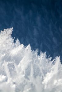
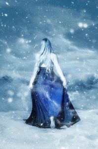


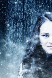
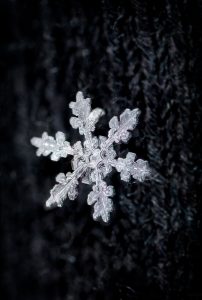

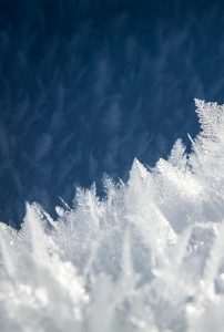

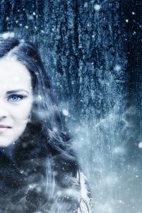
My favourites: 1 (or 8) and 2. I like the idea of 6, but it doesn’t grab me the way you probably want it to.
Book contains no fractals – sorry to disappoint! Thanks for the votes – will record and brood accordingly.
I like 1 and 2. I like the idea of the woman’s half face but I think her facial expression has a subtle air of sneer or something not so pleasant.
I wonder if a person in the picture is more engaging than just ice – not sure.
Duly noted – thank you!
I hear having a person on the cover of a fantasy novel is very important in some markets (e.g. the U.S.) but less so in others. But as far as I know there’s nowhere which is anti-person-on-the-cover so it might well be a good way to go.
I like 8 best – it is a more startling version of 1, because it is growing across instead of reducing. I also like 5 best of the ‘person’ ones, less friendly than the reverse in my perception! I would have preferred 2 if she wasn’t holding her dress, like a debutante.
So, 8, then 5, then 2? Or should 1 be in there somewhere?
It does seem a little odd that a woman dressed in such unsuitable clothing for walking through the snow should worry about raising her hem out of the way, but public domain images of women walking through the snow in suitably unsuitable clothing are hard to come by…
I’m really not sure about these pictures. I think the half faces aren’t bad, but I always imagined Winter with thin lips and a less beautiful face! I have a photographer friend here who took some other amazing snow photos – snowflakes and dogs in particular – she may consider letting you use. No 2 and the two landscape ones do match with the story quite well, but I agree with Carol above that the woman looks a bit debutante. However, that image does embody the fantasy aspect well. If the lettering was sufficiently good, no’s 1 and 8 are intriguing, and don’t give away anything about the story except the cold. Sorry to be so indecisive!
That’s all right! You’re not half as indecisive as I am – or this post wouldn’t be so lavishly illustrated 😀
Snowflakes and dogs do sound very apposite, but I am particularly keen to use a Public Domain image, as anything under a more restrictive license could cause issues around “this book is CC… except for the bits that aren’t.”
Number 10 – somehow standing on the left side makes a difference. Number 9 seems to be a good alternative.
Thanks for your vote!
What’s the verdict?
1 or 8 seems to be the popular verdict. Just exactly how that looks will be revealed in due course… once the cover is actually created.
Thanks for taking an interest!